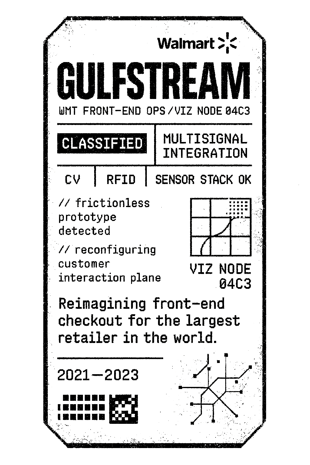
GULFSTREAM
GULFSTREAM
Reimagining the front-end checkout experience for the largest retailer in the world with its ambitious new hands-free autonomous checkout experience
Company:
Company:
Walmart
Walmart
Role:
Role:
CX/UI Design, Prototyping, Research
CX/UI Design, Prototyping, Research
Date:
Date:
2021 - 2023
2021 - 2023
Designing & defining the user experience for Walmart’s autonomous checkout system of the future.
Designing & defining the user experience for Walmart’s autonomous checkout system of the future.
Gulfstream was Walmart’s ambitious R&D initiative to reimagine the front-end checkout experience—building a frictionless, autonomous system that could rival (and outscale) Amazon’s “Just Walk Out” tech. I was brought in to design the customer experience from the ground up, taking on the daunting challenge of making something that felt radically new… feel intuitive.
Walmart’s Chief Product Officer challenged my team to explore how AI could create meaningful impact—right now, and at scale—at Walmart, and not in some distant, hand-wavy future.
Identify key problems within all parts of the org—from Home Office, to store-level ops, vendor integration, and customer needs—and design near-to-medium term solutions that solve these real problems across stores, corporate teams, and customer touch points using AI in its many forms.
My Role
My Role
My Role
Helping lead CX and UX design, I was responsible for:
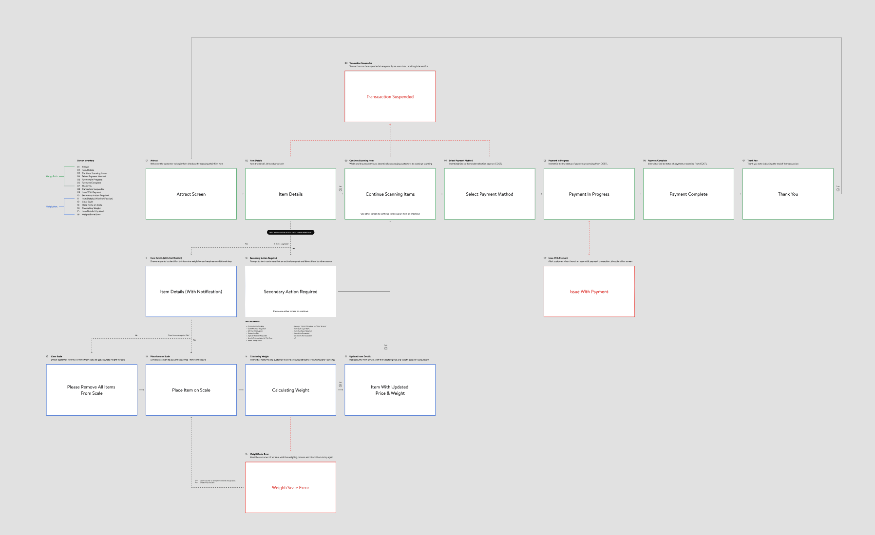
• Designing full end-to-end interaction model and instructional UI
• Advocating for clarity, simplicity, and cohesion across a sprawling physical/digital experience
• Cross-functionally partnering with research and engineering from the broader Walmart design & engineering orgs to help integrate Walmart's proprietary checkout software, COSTL
• Navigating hardware, and usability limitations while pushing toward better, more scalable experience models
I spent countless hours on-device in real stores with real customers, associates, and store managers—testing, iterating, and refining the flow. Everything from the language and iconography to the timing of lights and audio cues was tuned to reduce cognitive load and increase customer trust.
Helping lead CX and UX design, I was responsible for:
• Designing full end-to-end interaction model and instructional UI
• Advocating for clarity, simplicity, and cohesion across a sprawling physical/digital experience
• Cross-functionally partnering with research and engineering from the broader Walmart design & engineering orgs to help integrate Walmart's proprietary checkout software, COSTL
• Navigating hardware, and usability limitations while pushing toward better, more scalable experience models
I spent countless hours on-device in real stores with real customers, associates, and store managers—testing, iterating, and refining the flow. Everything from the language and iconography to the timing of lights and audio cues was tuned to reduce cognitive load and increase customer trust.

UX RESEARCH
Designed in the Wild
Designed in the Wild
Designing for Gulfstream (and Multisignal) meant venturing into uncharted territory. There were no real existing paradigms to lean on—only hypotheses to test, and human behaviors to decode. We conducted rigorous, hands-on research in stores, bringing in everyone from store managers and associates to everyday customers across a wide range of regions and demographics. Each prototype, flow, and feedback moment was scrutinized on-device, in real-world retail environments—because anything less wouldn’t cut it.
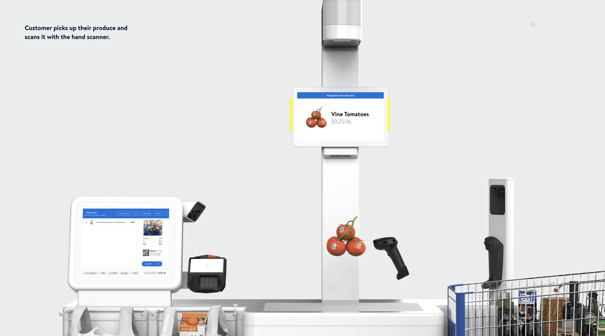
We observed where customers hesitated, when they glanced around for help, how they responded to unfamiliar signals, and what built (or broke) trust. The result was an iterative feedback loop: prototype, test, refine, repeat—until we landed on an experience that not only worked technically but also felt intuitive. From the “lift-to-weigh” pattern to micro-interactions like lighting cues and audio feedback, every piece of the system was tuned through live research to reduce friction, support clarity, and respect customer mental models—whether tech-savvy or not.
Approach
& Process
Approach
& Process
Approach
& Process
Gulfstream was the kind of project that doesn’t come with a map. There was no template for what we were building—just a jumble of sensors, hardware constraints, and big ambitions. Designing an autonomous checkout experience at this scale meant inventing new interaction patterns, rethinking decades of shopper behavior, and translating bleeding-edge tech into something customers could actually understand.
From the very beginning, the work demanded rigor. Every assumption had to be tested, every UI element scrutinized. We prototyped early and often—on-device, in-store, with real people. Walmart associates, store managers, everyday customers—each brought different expectations, and every test gave us new insight into how to bridge the gap between technological complexity and intuitive experience.
The process wasn’t linear, and it wasn’t easy. Early hardware decisions (like the two-screen setup) introduced real constraints—but instead of letting that compromise the experience, I leaned in. We designed around it, tested through it, and eventually evolved it into the more unified, single-screen Mk4 experience I’d been advocating for from the start.
This wasn't just about "UX"—it was about choreography.
This wasn't just about "UX"—it was about choreography.
This wasn't just about "UX"—it was about choreography.
Gulfstream required a tight feedback loop between instruction, interaction, and trust—backed by months of in-the-wild testing and obsessive iteration. And in the end, we built something elegant, patent-worthy, and powerful enough to roll out across one of the largest retail ecosystems in the world.
Gulfstream required a tight feedback loop between instruction, interaction, and trust—backed by months of in-the-wild testing and obsessive iteration. And in the end, we built something elegant, patent-worthy, and powerful enough to roll out across one of the largest retail ecosystems in the world.
Articulating The Solution
Articulating The Solution
Articulating The Solution
Solving for Gulfstream wasn’t just about designing a clean UI—it was about designing an entire multisensory system around a radically new experience. Our approach had to be holistic and deeply considered, stretching far beyond the screen. We took on sound and light design—each needing to feel intuitive and unobtrusive, while also respecting Walmart’s legacy “tri-light” system that associates had relied on for decades. The physical footprint of the experience, what we called “the cockpit,” required careful ergonomic planning to ensure the flow felt natural, comfortable, and guided—especially for first-time users encountering something so unfamiliar.
Solving for Gulfstream wasn’t just about designing a clean UI—it was about designing an entire multisensory system around a radically new experience. Our approach had to be holistic and deeply considered, stretching far beyond the screen. We took on sound and light design—each needing to feel intuitive and unobtrusive, while also respecting Walmart’s legacy “tri-light” system that associates had relied on for decades. The physical footprint of the experience, what we called “the cockpit,” required careful ergonomic planning to ensure the flow felt natural, comfortable, and guided—especially for first-time users encountering something so unfamiliar.
Keeping it "Walmart"
Visually, we had to adapt Walmart’s brand in a way that was elevated, modern, and instructional without feeling sterile or overly corporate. The biggest challenge came in designing what was essentially a teaching interface: a screen experience that needed to show customers how to checkout, without overwhelming or condescending them. On the original dual-screen setup, this meant avoiding awkward layout pitfalls (think: floating callouts and weird visual hierarchy) and finding elegant ways to balance motion, text, and feedback without making the whole thing feel “horsey” or mismatched to the scale of the hardware.
My role on the project was multifaceted and full-stack, stepping into several roles in realizing the vision for the several concepts on the project.
• Led UX Research (w/ dozens of interviews, synthesis, insight mapping)
• Owned product concepts, design and prototyping
• Produced high-fidelity concept videos for all three product concepts
• Built the executive-facing story that I presented to Walmart’s CPO
• Balanced research, design, storytelling, and strategy—end to end
The Mk4—single screen at last
The transition to Mk4 was more than just a hardware revision—it was a culmination. It marked a turning point.
After months of research, testing, and iteration, we finally had the opportunity to consolidate the experience into a single, unified interface. The original two-screen setup had introduced constant friction—splitting attention, breaking flow, and confusing users at critical moments. With Mk4, we brought instruction, interaction, and feedback together in one cohesive display. The result was a dramatically simpler, more intuitive experience that resolved nearly every UX issue we’d been battling. It wasn’t just cleaner—it was the embodiment of everything we’d learned, and a major step forward in making Gulfstream truly feel effortless.


Keeping it "Walmart"
Visually, we had to adapt Walmart’s brand in a way that was elevated, modern, and instructional without feeling sterile or overly corporate. The biggest challenge came in designing what was essentially a teaching interface: a screen experience that needed to show customers how to checkout, without overwhelming or condescending them. On the original dual-screen setup, this meant avoiding awkward layout pitfalls (think: floating callouts and weird visual hierarchy) and finding elegant ways to balance motion, text, and feedback without making the whole thing feel “horsey” or mismatched to the scale of the hardware.
The Mk4—single screen at last
The transition to Mk4 was more than just a hardware revision—it was a culmination. It marked a turning point.
After months of research, testing, and iteration, we finally had the opportunity to consolidate the experience into a single, unified interface. The original two-screen setup had introduced constant friction—splitting attention, breaking flow, and confusing users at critical moments. With Mk4, we brought instruction, interaction, and feedback together in one cohesive display. The result was a dramatically simpler, more intuitive experience that resolved nearly every UX issue we’d been battling. It wasn’t just cleaner—it was the embodiment of everything we’d learned, and a major step forward in making Gulfstream truly feel effortless.
REFLECTIONS
Not every moonshot lands—but the right ones ripple.
Gulfstream was never just about checkout—it was about rethinking one of the most universal moments in retail and designing a future-ready solution from the ground up. While the original program has since been paused, the work we did lives on in meaningful ways: our Multisignal platform continues to pilot in select stores across the country, and the design principles, research patterns, and interaction models developed through Gulfstream have directly informed the next generation of Walmart’s front-end experiences.
For me, the project was a masterclass in designing with ambiguity—navigating hardware constraints, new technologies, and deeply human behaviors to create something that felt not just possible, but inevitable. In a space where there were no real comps and no clear answers, we built clarity from the chaos. And that, to me, is the real win.